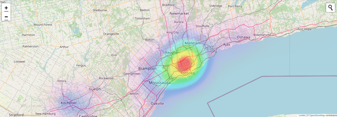
Praise God because you have come across the heatmap video to demonstrate how to find places that wont obliterate your pockets. It lets you find neighbourhoods that don’t have sky high rent or housing prices that are also near big cities. It also shows you a way out if you love your parents but don’t want to live with them, have spent enough time living with roommates, or if you’re tired of renting. A short GIF animation would have done the job, but the creative itch produced a little clip demonstrating how to use the heatmap to find the info you need.
Praise Jehovah for finding an artist as talented as Eman’s Tracks. Came across “In His Presence” and after a few listens those juicy bass lines were starting to stick. Eman’s Tracks mainly makes Christian gospel and African music. Which made this track very familiar due to hearing lots of similar sounds on the home continent.

There are some sub titles thrown into the heatmap video to caption what each clip or section is highlighting. Not just regular sub titles. Animated motion sub titles. They are way more interesting than static text.

There’s random clips of different places. Why is that? Excluding Mexico most people in North America live in or are near places like New York, LA, Dallas, Toronto, and other big cities on the continent. If you’re a local and you live in the top 5 or 10 metros on this continent you’ll probably recognize some of these places.
You’ll see some of the features that this site has, like the ability to vote for the picture that best reflects what your area looks like and also being able to preview the area by watching a video about the area. And also being able to watch the most relevant video about your area to get an idea of what it’s like. There’s clips of families and people together in groups to encourage unity.
What do you think of the heatmap? What towns have you come across using the heatmap that you previously were not aware of? What other features would you like to see? Leave a comment with your answer and share the content!


